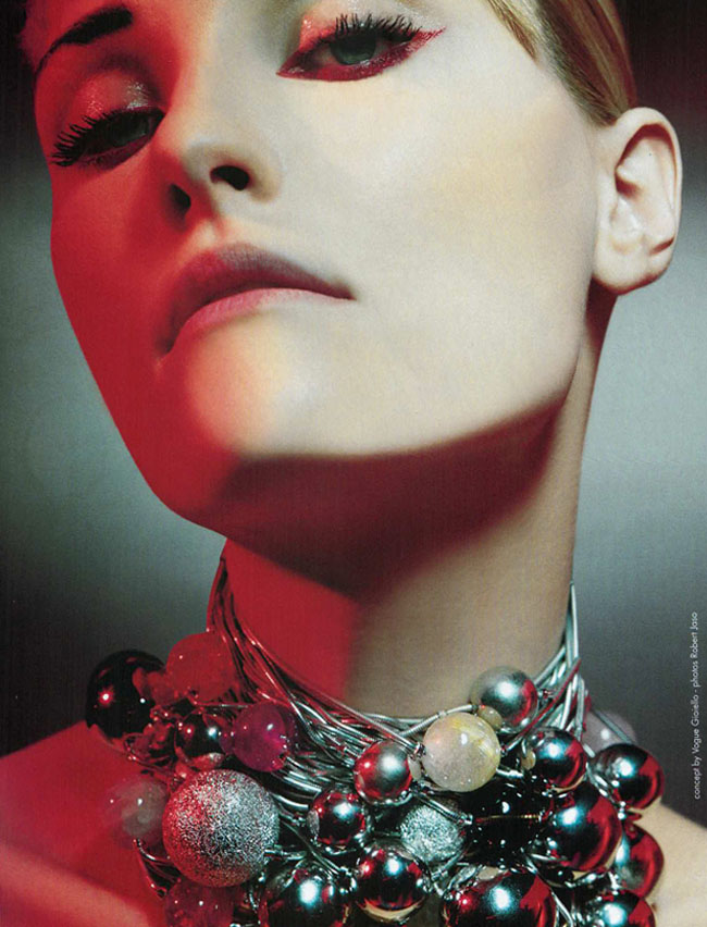
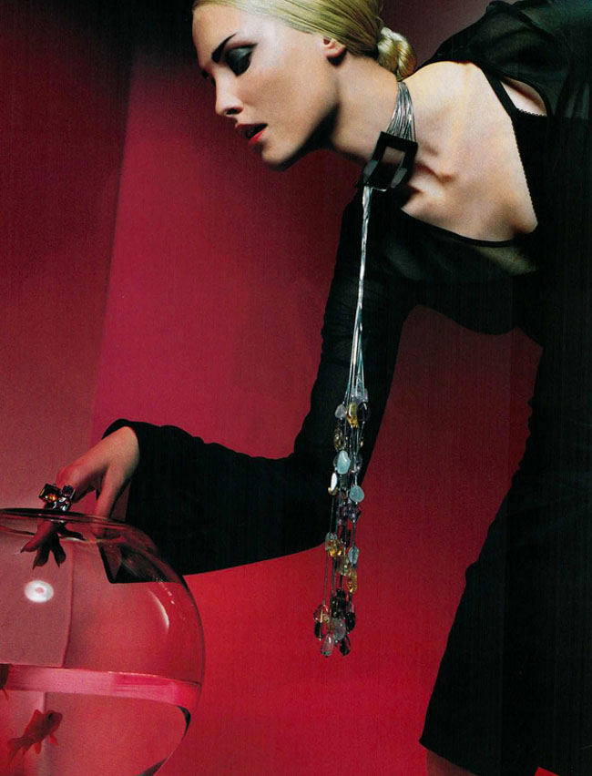
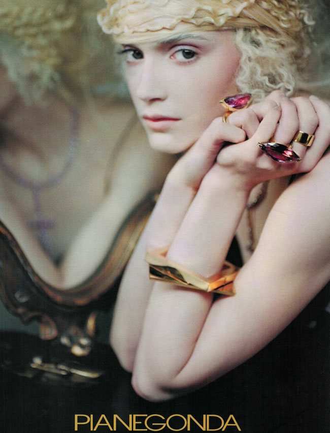
Some of the advertisements in this issue are as creative and forward as some of the editorials, more so in my opinion! Pianegonda is one of my all-time favorite fine jewelry brands for color and bold style. Just a small sampling of some beautiful pieces that stand the test of time – I would wear any of the pieces today – yes, please.
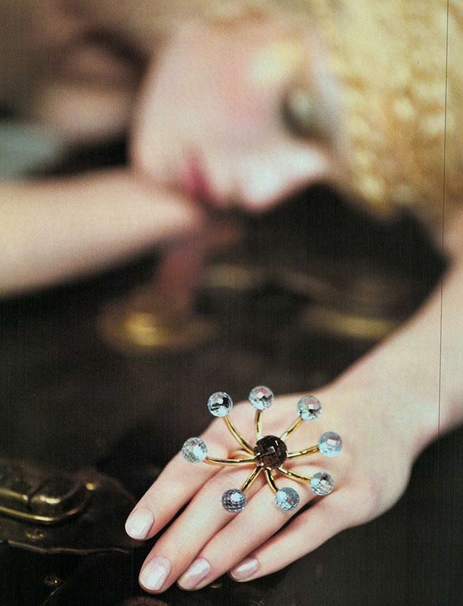
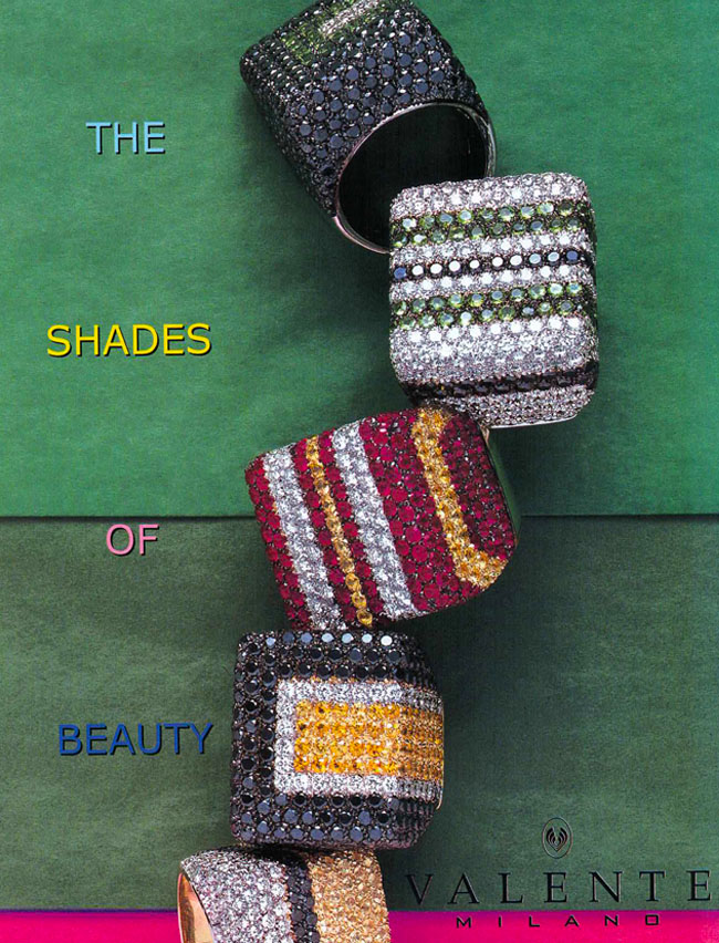
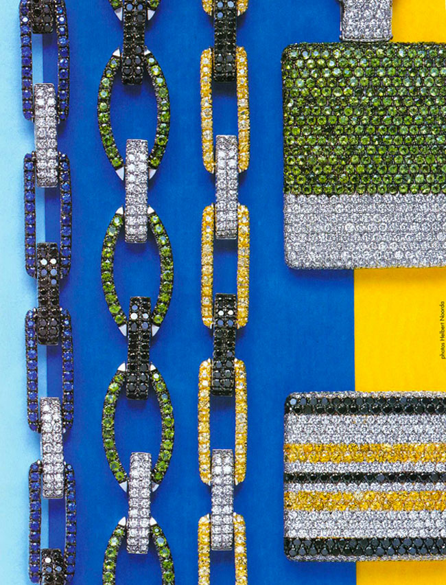
I usually love anything in a pavé setting, just my taste. Some of these images really show it off well with rich color combinations and geometric lines. Classic styles with a luxury twist, it’s what dreams are made of.
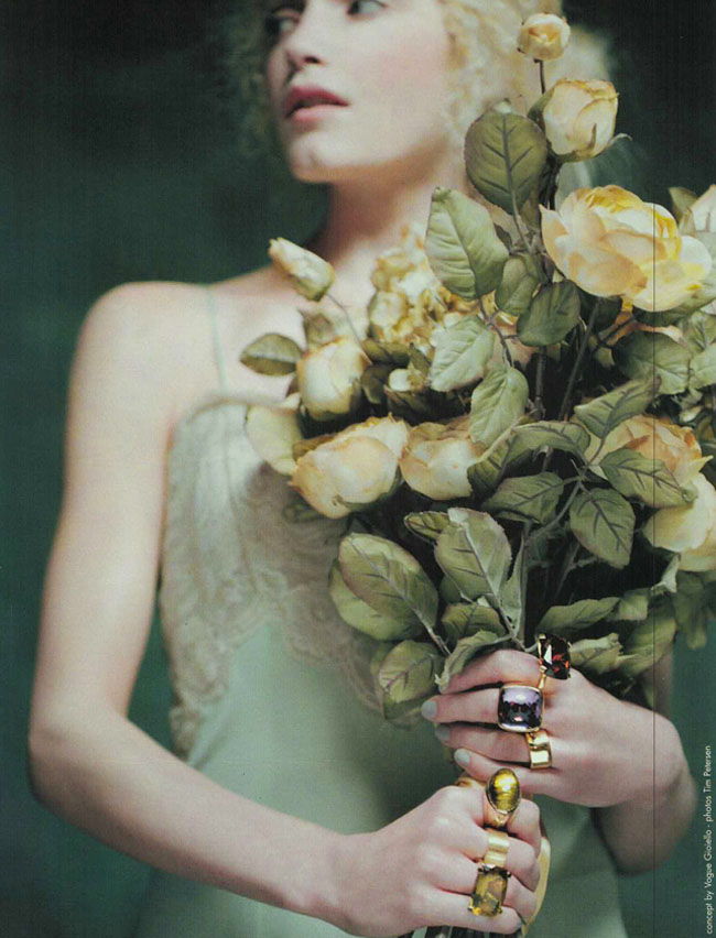
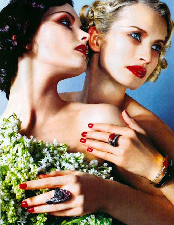
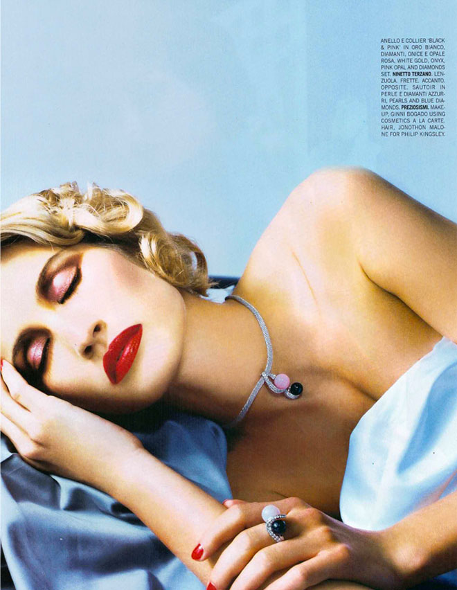
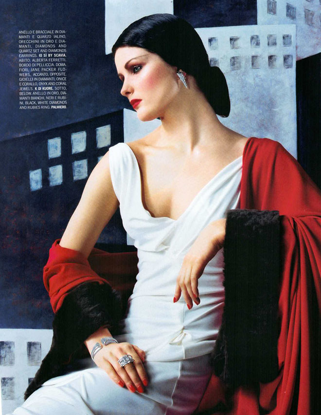
Red lips, red nails and gorgeous jewels. It’s hot, it’s classic gorgeous and it makes you want more. More beauties wearing beauties….
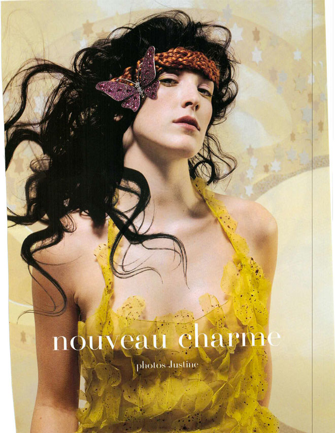
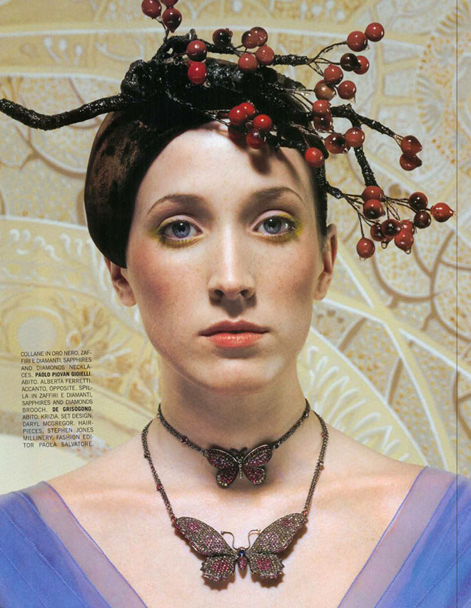
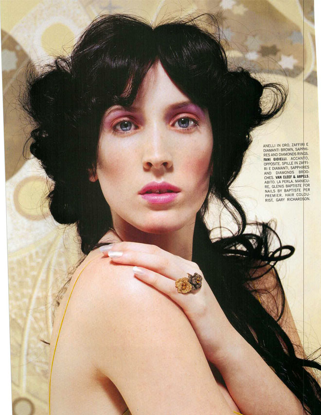
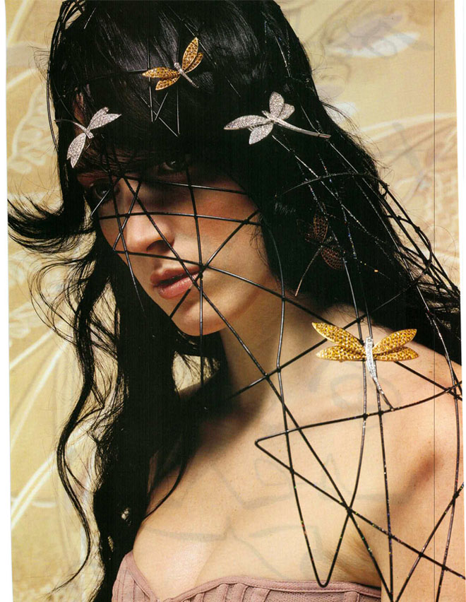
Nouveau Charme is hippy chic and full of butterflies and head pieces. Minimalistically styled and simple – highlighting the jewels and clean makeup. Beautiful spread….
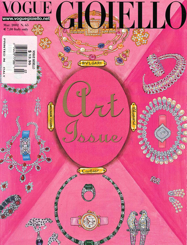
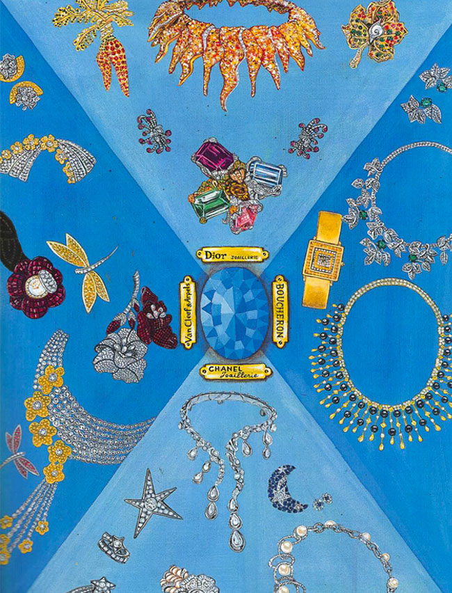
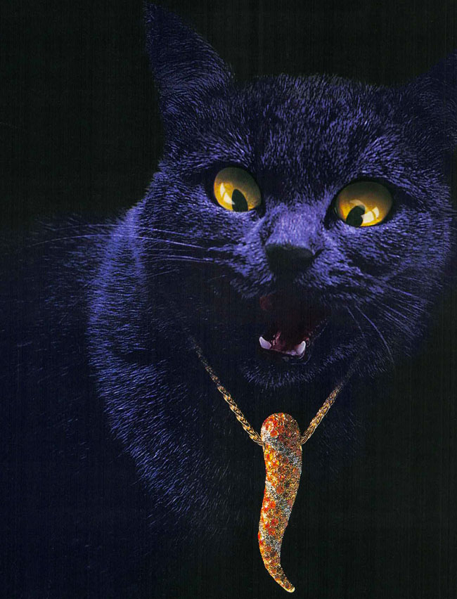
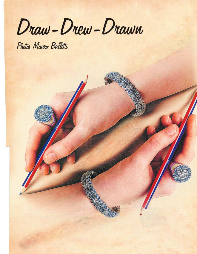
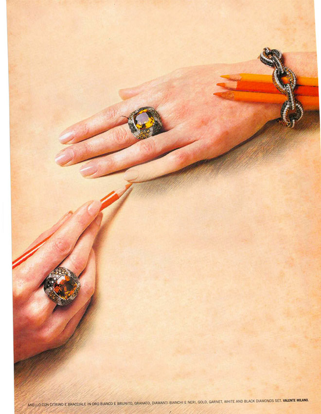
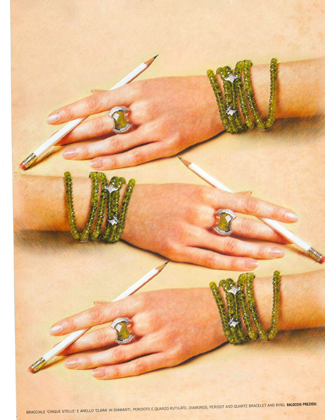
Draw Drew Drawn is just super creative and I love the idea behind the artwork for this layout. Assuming this was pre-photoshop and that this was actually done by an artist – I am in awe of the pure talent.
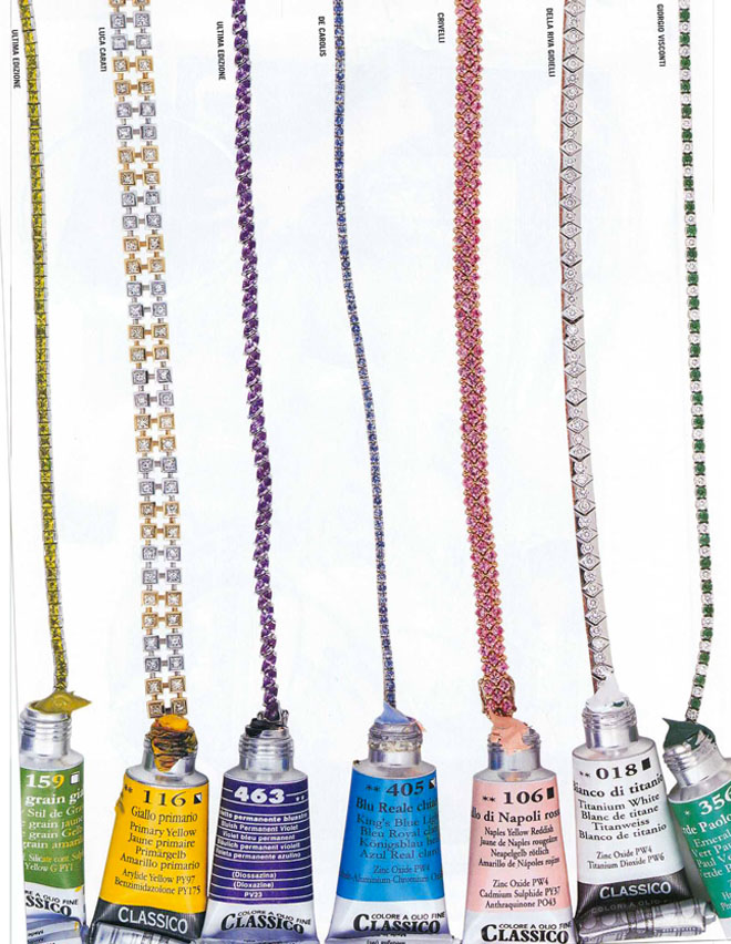
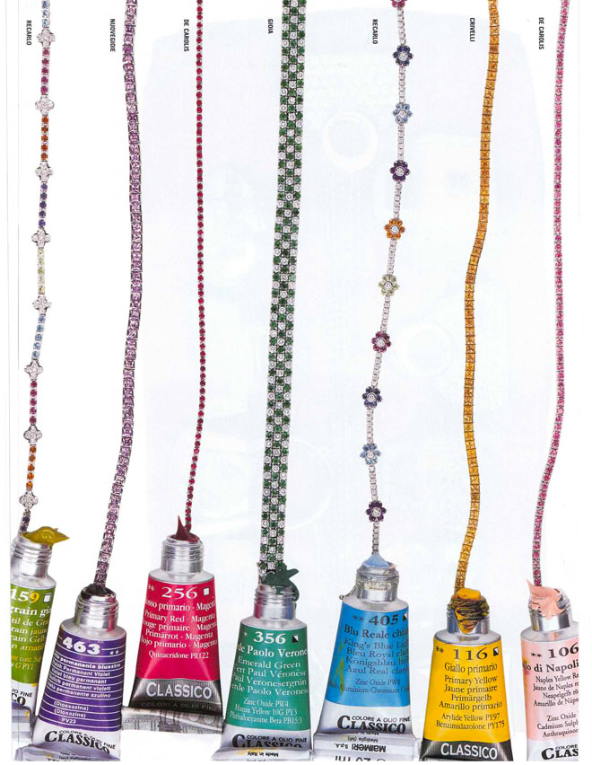
Tubes of paint and strands of set stones all in one place – now that’s a happy place.
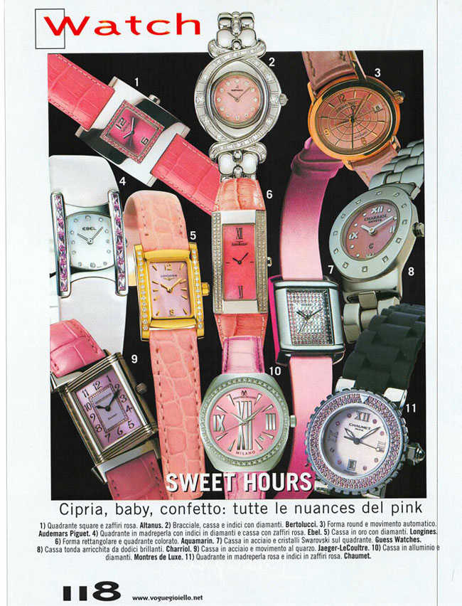
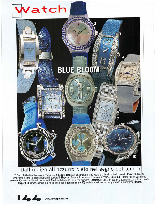
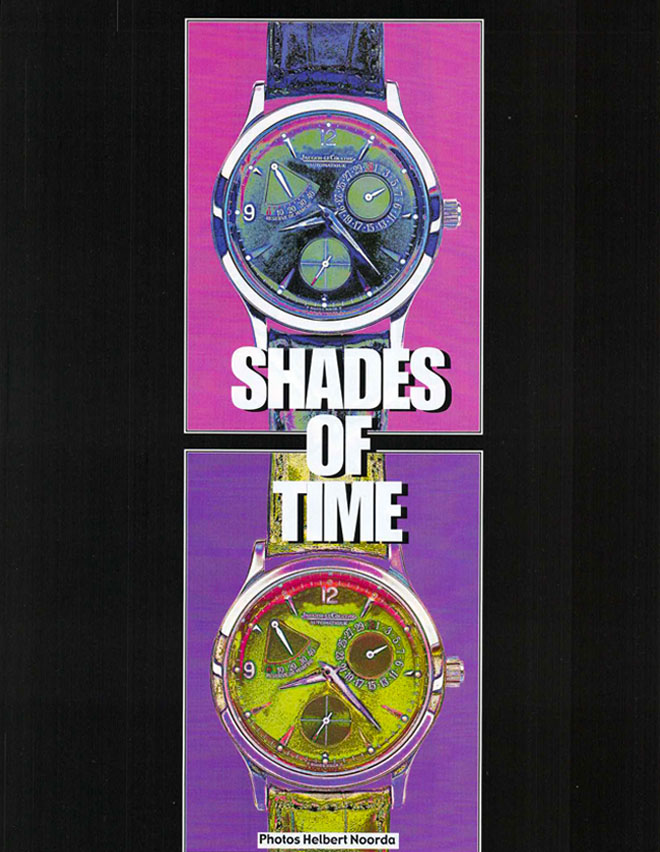
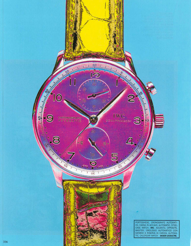
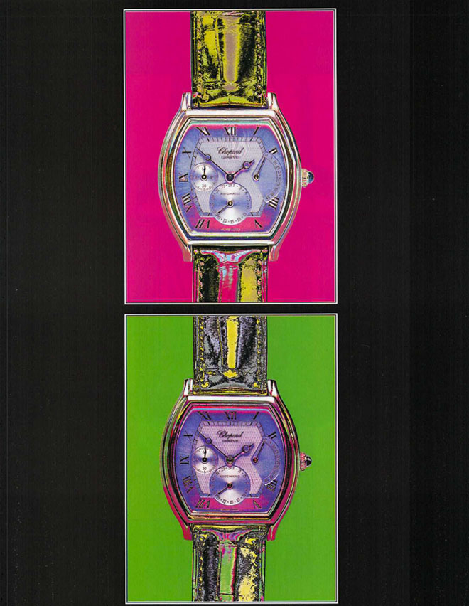
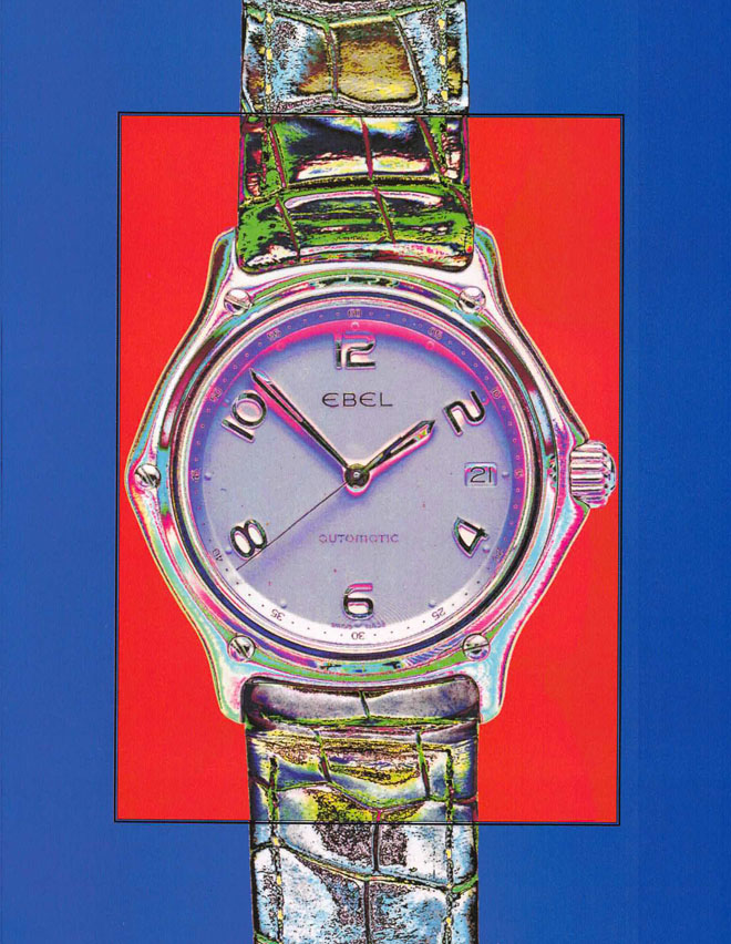
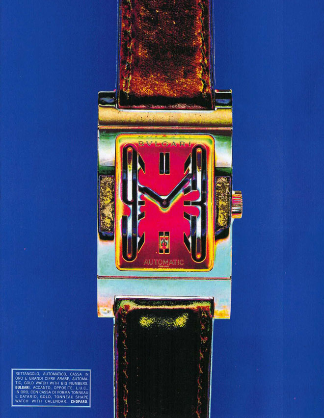
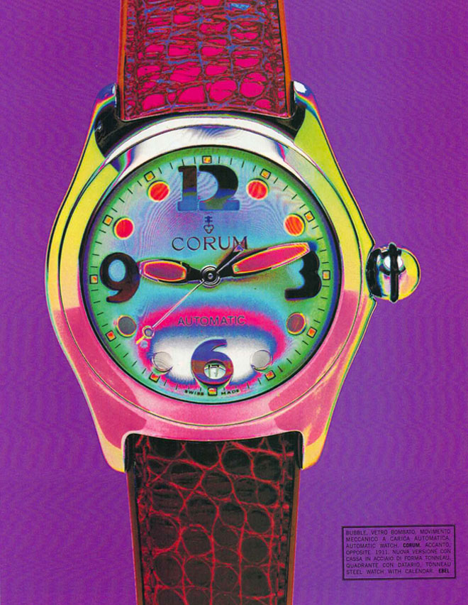
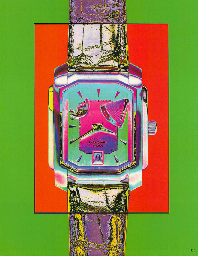
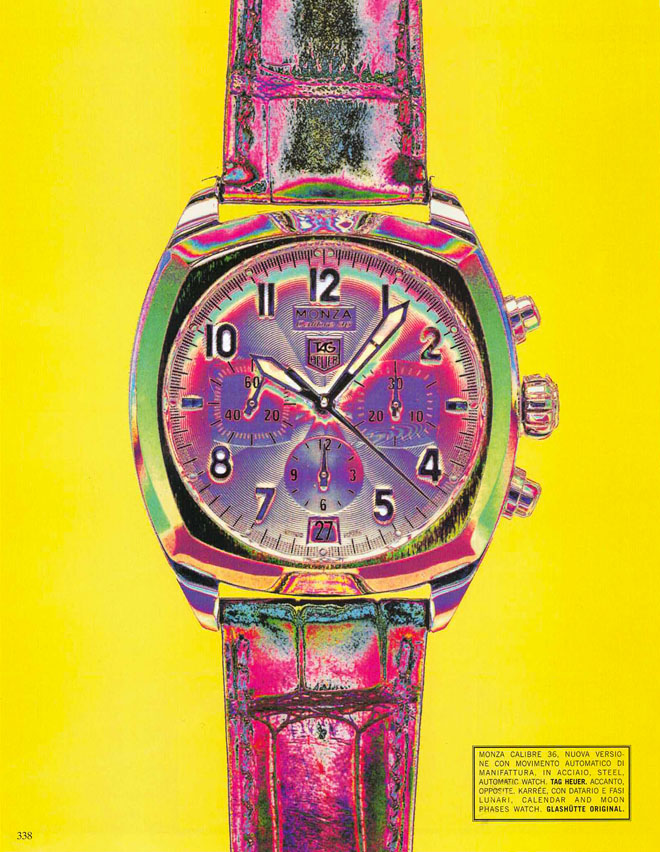
Then, The Sands of Time – an homage to color, to watches. Classic, luxury, bold and beautiful – overlayed with an acid color wash. It’s all just too much in the best possible way, eye candy overload. Watches are not just for telling time, they tell a story too.